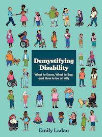
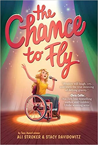
The best covers show a range of diverse, disabled people or characters and how their disabilities affect them. Some disabilities are less visible than others. So, depicting disability accurately means it might not be obvious when characters are disabled. Duyvis and Whaley distinguished this fact from the artistic choice to minimize or hide a character’s disability: to blend it into the background or symbolize it. In 2017, Carrie at Autostraddle hilariously satirized stock photos of disability, especially images meant to be “inspirational.” These stereotypical images, such as “overcoming” disability, or equating all disabilities with manual wheelchair use, make their way onto book covers as well. If few accurate references are available in 3D and photo databases, that can exacerbate the stereotypes and inaccuracies. Since 2016, many more books have been published by disabled authors, featuring disabled characters, or with wheelchair users on the covers. I also loved seeing disabled students and hearing the phrase wheelchair user on Abbott Elementary. I use mobility aids but rarely use a wheelchair. So, I asked some wheelchair users for their opinions on books with wheelchair users on the covers. I asked about trends they’d noticed, their favorite and least favorite covers, and why they like or dislike them. Are there common inaccuracies or stereotypes on covers featuring wheelchair users? How can these covers be improved? She added: “On the rare occasion I have seen a wheelchair on [a] book cover, I feel like it’s been a very hospital-esque version, which isn’t an accurate representation of the diversity of types of wheelchairs at all.” This is a great point. There are a lot of hospital wheelchairs on book covers, and not all wheelchair users use that style. For medical reasons, many people need customized wheelchairs, but there can be financial and/or insurance reasons why they use hospital-style wheelchairs instead. It’s always best to show the diversity of disabled people, instead of assuming we’re all the same in any way. Autumn Wise described herself to me as a “wedding planner, power wheelchair user, and funny Goth in training.” She said she sees wheelchair users on book covers now “more than I saw growing up, but I’d be quick to point out that it doesn’t expand equally across many age groups, genres, or other axes of diversity. Most of the covers with wheelchairs/wheelchair users on the cover exist in the children’s books or nonfiction space with white folks centered in the imagery. In summary, there have been minor improvements in visual representation, but the book cover design industry still has a long way to go to give us the rep we deserve across all channels of diversity.” Like Emily Ladau, Autumn Wise thinks that a lot of covers show manual, hospital-style wheelchairs because non-disabled people are probably most familiar with those. Autumn clarified: “Not just any manual chairs, but the generic ones you find in a clinical setting that aren’t properly fitted to the individuals’ bodies.” She also explained another misconception that some non-disabled people may have about wheelchair users and why they may relate more to manual chair users. Some people may assume mistakenly that manual wheelchair users are more “active” or “independent” and power chair users are more “passive.” As I said earlier, every person’s disability affects them differently. Reviewers often criticize marginalized characters’ lack of “agency.” Being unable to push oneself in a wheelchair, walk, or speak, for example, should never be conflated with autonomy or agency, even in fiction. Autumn said: “In my experience, people treat independence as some kind of disability worth token, that only if you’re completely independent, are you a worthy disabled person.” Autumn pointed out that many people customize their wheelchairs, which would be great to see more often on covers. “Give us powerchairs with cool features, like stickers on the back, or a fun joystick, or a sporty manual wheelchair with some cool hot pink rims, anything to give our wheelchairs some personality. They are an extension of our bodies. Treat them as such!” she said. She added that with covers with wheelchair users, the disabled characters should be important to the story, not just used to inspire non-disabled readers: “You shouldn’t see yourself represented on the cover of a book, only to then read a story that teaches you that your only value comes from inspiring others.” I love these because the characters look happy and passionate about performing. Inspiration is a loaded word in the disabled community. However, when an award-winning singer and actor who uses a wheelchair puts wheelchair users on the cover of her book, that’s inspirational in a totally different way from non-disabled people labeling us as inspirational. How Inclusive Is That Diverse Book Cover, Though?


